Powered by Blogger.
Showing posts with label Art Journal. Show all posts

Sing of Your Love


Hi friends! Today I'm popping in with a little something different. I've been trying to devote some time to just playing around with my supplies without a DT requirement in mind.  So I had the idea to do a loose leaf art journal, which I'll eventually top bind.

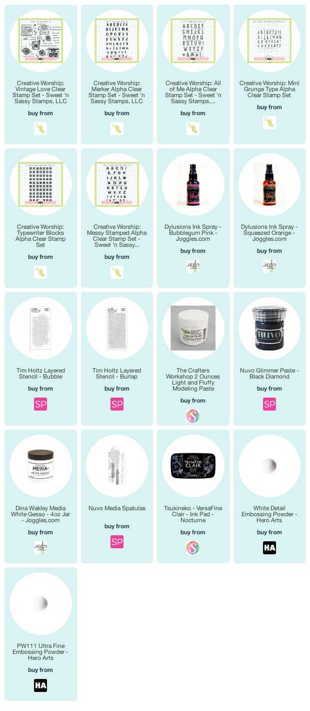
I started with a 11" x 15" sheet of watercolor cardstock, scored at 5.5". I then sprayed with Dylusions spray in pink and orange colors on one half and folded in half to sandwich the ink and spread it to the entire page.  When it was dry, I cut it on the score line, so I could have two 5.5 x 7.5" pages with backgrounds done.  I had this song in my head, so pulled out the Vintage Love set and embossed the radio image in black and colored with Zig clean color real brush markers. This is fussy cut to add to the page later.  While I was at it, I embossed some of the flowers from the set in white on a scrap of paper that had been sprayed with the same colors.  These are fussy cut as well.


I added a little background texture with the music note stamps, and the sheet music image from Texture Tiles 1. Next I added some stenciled accents with molding paste and black glimmer paste, making sure to leave room for the song lyrics.  I used a mixture of a bunch of alpha stamp sets to create the words, then added some white gel pen accents to make them pop.  

Finally I added my fussy cut pieces and used a gelato and a bit of white gesso to add some random texture and to edge my journal page.  This was super fun, and I'm sure there will be more to come.

Thanks so much for stopping by today! I hope you have a fabulous day!

Compensated affiliate links are used where possible. When you place an order after clicking one of my links, I receive a small commission at no additional cost to you. Thanks so much for using my links and supporting this blog. 💙

Wideness of the Sea

Hi friends! Today I'm sharing an art journal page with y'all. I don't typically photograph my pages, but I just started a new journal and liked how it turned out, so here you go!


This page, like most art journaling pages, did not turn out at all how it started! I randomly watched a YouTube video the other day and the artist created an entire landscape with just a couple drops of acrylic paint and a big round brush and palette knife. I really wanted to give it a go, so I pulled out some of the closest paints I had, which happened to be impasto paints to experiment.


Now, impasto paints are much thicker than traditional acrylic paints, and I forgot this little nugget of knowledge... until I plopped my brush into my drop of paint and the paint didn't move like it should have! LOL I then grabbed a stencil brush thinking maybe that would help it move a little better, but nope. Not the effect I was going for. So out came the baby wipes and I tried wiping it away. And wouldn't you know, a little serendipity.... the wiped down surface looked wave like. So I continued adding paint, wiping it away, etc, until I achieved a background I liked.

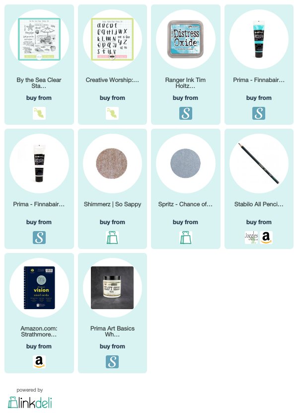
Then I added the quote from By the Sea in the lightest portion of the page. It says,  There is a wideness in God's mercy like the wideness of the sea. - Frederick William Faber. Playing off the sentiment, I added the word mercy using the Happy Alpha set in broken china. I added some accents with a white gel pen and then started wiping in a bit of chance of rain spray to add a little depth to the waves.


I masked a couple of the sea shells from the set and stamped them overlapping in the corner and painted with a little So Sappy Shimmerz paint.  Next I added a little ephemera piece on the side and outlined with a black stabilo marks all pencil, then blended with a wipe and added some black in the same way to the edges of the page as well.

Thanks so much for stopping by today! I hope you have a fantastic weekend!

Compensated affiliate links are used where possible. When you place an order after clicking one of my links, I receive a small commission at no additional cost to you. Thanks so much for shopping from my links and supporting this blog. 💙

Hope Art Journaling

Today I thought I'd pop in with a little something different. I was revisiting a technique for a card I can't show quite yet and it didn't turn out the way I expected. I decided to look back at the first time I tried the technique to see what the difference was. If you're curious, the difference was white space, which my new attempt had none. Go figure! 😁

Anyhow, this is the project I looked back on. It's an art journal page I made a little over a year ago. I struggle with depression and the past few years have been pretty hard in my little mind castle. Nowhere near as hard as so many dealing with devastating circumstances, but still impactful nonetheless.


Creativity is one of those things you can't force. It has to flow from your heart to be meaningful. You can practice and practice and you can go through the motions and create something that's pretty, but without the heart and soul of the piece, it's just a shallow prettiness. Not that soul-cleansing kind of beauty that shines deeper. Not the kind that ignites your worn out soul and makes you want to create more and more. I think I'm finally getting to a place like that again, but it's taken over a year and the closing of my business to get there. Marching ever forward, my friends. Ever forward.


When I sat down to art journal this page all those moons ago, I was feeling blue. I hadn't art journaled in quite some time. I absolutely love it, and keep telling myself I should make time for it way more often!  I had recently seen an acetate smooshing technique with magical powders on Instagram and decided I wanted to give it a go. I even set the camera up to record the journaling process, but my computer decided to corrupt the file when I imported it and deleted the original at the same time.  Technology 1... me 0.

The pages are treated with heavy gesso and then I used a stencil and light paste for some texture.  Next I sprinkled on the powders, then spritzed the acetate and blotted it on the pages, smooshing it down and adding more powders and re-applying the watery acetate until I achieved the background I wanted.


The only word that kept coming to me was hope and it made me think of this Emily Dickinson quote. So I pulled out the old Verve Hope Perches plain jane and stamped in archival ink on some pretty Prima packaging I had laying around. Next I found some feather ephemera in my stash and mixed up some of the magicals powders with water to watercolor the feathers, then also added a bit to the sentiment piece and layered them onto my page.


Next I found the word hope in an ephemera pack along with those little monochromatic chevron pieces and as luck would have it they totally matched the layout.  I added them, then did a little accenting with black and white pens to incorporate them into the page.  I finished with another bit of packaging that I journaled on and stamped the date.

Thanks so much for stopping by today! I hope you found a bit of inspiration here.

Good Times Inspiration

Hi friends! I'm popping in today with a little art journaling to change up the scenery.

This is the first year in many where I didn't write resolutions, pick a word of the year or do any of those fun make this year count activities.  I spent 8 hours of December 31 in a hospital waiting room, then went home and took care of my 3 boys.  Then I woke up the next morning and packed orders and counted thousands of stamps and dies and took care of my 3 boys.  And again the next day. And the next day. And it's a week later and I'm just beginning to come up for air.

I started using an Erin Condren Life Planner in November.  But it hasn't been opened since the week before Christmas.  Life is hectic.  Life is messy. Life sprawls all over the place and doesn't fit neatly into little boxes in a spiral bound planner.  And life doesn't seem to ever go as planned, which makes a mess in all those little boxes. And when life is so busy and every spare minute counts, there's no time to plan. So right now for 2015 I'm just winging it. And that's okay.  I think.  ;)

The one thing I did plan on this year was Donna Downey's Inspiration Wednesdays.  My goal is just to watch them all, but I'm hoping I can participate as well.  So last night once the boys were asleep and Mark was happily playing xbox, I snuck into my studio and watched the video AND did a page. Well... after I braved the closet to find the inspiration journal I had purchased a year ago and never used!


As I was digging through said closet, I found a book of vellum sayings from years gone by that had the phrase "These are good times so don't forget to smile and enjoy yourself".  I thought it was the perfect mantra for me at this point in my life, so I set it aside.  Once I watched the video and saw there was a word going down the side of Donna's page, I just had to do my own version with the word SMILE and use the vellum quote I had found.  Because I need to remember that these ARE good times.  They sure don't seem like it most days... but every day I see little glimpses of how magical the world is through a toddler's eyes. How lovely to experience everything new.  To discover Christmas and chocolate and laugh hysterically at the sound of the words mashed potatoes.


So that was what was going on in my head as I created.  Went with my favorite paint color... cobalt teal and added some shading with walnut stain distress ink, then used some faber-castell Pitt pens and a baby wipe to do most of the black, with just a bit of graphite pencil added in as well.  The hearts are die cut from music sheet paper and the butterfly tag was found in a package tucked into the inspiration journal.  Serendipity! All in all, super fun and a great start to a new journal.

Thanks for stopping by today!

One Day at a Time

Hi friends!  Happy Tuesday!  It’s the 5th of the month and that means it’s time for our Diva Inspirations hop.  Along with the hop this month, we have two brand new plain janes to debut, so hop along to see a mixture of old and new and maybe even win a prize!  If you just happened by, head over to the Verve Blog for the full hop list and to start from the beginning.  If you came from Jen Tapler's blog, then you're on the right track!


The two plain janes we’re releasing today started out just as word art I wanted to use in my art journal.  But the more I thought about them, the more I wanted them in stamp form.  The first few months with twins have been challenging to say the least and the phrase one day at a time has taken on new meaning for me.  In the first couple months with the twins I couldn’t handle thinking beyond one day without sobbing.  To get through each day I just had to focus on one hour at a time… anything else was just too overwhelming.  I couldn’t see a future for myself.  But as the boys have started sleeping a little more, the hours have stretched to days and now I’m happy to say I’m able to look forward about a week without becoming too overwhelmed.  And anytime I get too scared about how much my life has changed in such a short time, I try to remember this little phrase...  one day at a time.  That’s all I can do.

So my first art journaling session since last fall had to be centered on this One Day plain jane.  In the wee hours of the morning when I’m feeding the boys, I plan out art journal pages in my head.  This was one of those planned out pages.  I was so excited to try finger painting instead of using a brush - it was so freeing!  For the background, I used medium body acrylics, and then cut pieces of cardstock to form the flower petals.  To the left is a little close up of the flower which is finger painted with acrylic paints and white and black gesso and I hand doodled the stem.

For a little texture, I used a doily stencil in the corner with a little light molding paste, then spritzed with some Mr. Huey spray after it had dried.  I added a little more texture with the graph stamp from the Making a Statement set.  The One Day sentiment is stamped onto copy paper, glued behind the flower and then taped on with washi tape.  I finished with a little air art tool to make the white not so stark.

Thanks so much for stopping by.  Be sure to check out all the prize details and the June sale info over on the Verve Blog.  Next up on the hop is the uber talented and super sweet Sankari!


Enabler's List:
Stamps: One Day Plain Jane, Making a Statement (Verve Stamps)
Paper: Watercolor 140 lb Visual Journal (Strathmore), copy paper
Ink: Medium Body Acrylics (Liquitex), Black Archival (Ranger), Black Gesso (Golden)
Accessories: Doily stencil (Christy Tomlinson), Light Molding Paste (Liquitex), Air art tool (SU!), washi tape (Recollections)


Be Still

Hi friends!  Happy Valentine's Day!  I haven't shared any art journaling with you for a while, mostly because I haven't been doing any.  I do have this teeny little page I created a while back that seemed like a good pick for today.


The Making Of:
The page is done in a mini journal measuring 3.5 x 5", so the surface is slightly smaller than a card front.  It's really a manageable size if you want to get your art on, but don't have a lot of time.  The Psalm 46:10 plain jane is stamped onto some dictionary paper and the hearts are cut from a paper doily using the Heart Trio CutUps from TCP.  The background and coloring is all done with Neocolor II crayons and I added some doodling with a permanent ink pen and a little rub-on down the side for some added texture.

The Inspiration:
I created this page back in September, the day after I found out we were having twins.  To say my entire world felt like it had somehow come unhinged would be an understatement.  This Psalm 46:10 verse was one I kept repeating over and over to myself in the hopes of calming the rising panic in my soul.  Be still and know that I am God.

As you probably guessed from the colors here, I was hoping for girls.  It wasn't long after I created this page that we found out we were having boys and I haven't done any art journaling since.  I had intended to remake this page in blues and greens, but somehow my heart just isn't in it.  I still cry sometimes when I think about two little boys running around the house.  Several family members were convinced I was having girls, and I got so many Hello Kitty baby things from them right at the start that I even get a little sad when I see Hello Kitty now.  I've had to box up all of my HK stuff just to keep myself sane.  And once again... Be still and know that I am God.

Although my babies will be boys, the heart of this journaling page still fits... a prayer that God would bless our family and that I would remember that it's all in His plan, and not in my hands.  So there are two little hearts below, representing our two babies, and a heart within a heart up top representing Mark and myself. 

And with less than 5 weeks to go I am FINALLY starting to feel a little excitement to meet these two little boys that will share our world and our hearts.  I know they will be perfect for us... and I'll continue repeating this verse throughout their lives ...  Be still and know that I am God. 


Enabler's List:
Stamps:  Psalm 46:10 plain jane (Verve Stamps)
Paper: dictionary page, 3.5 x 5" Visual Journal (Strathmore), paper doily
Ink: Neocolor II artist crayons (Caran d'Ache), black pen
Accessories:  Heart Trio CutUps (TCP), rub-on

Anything is Possible

Hi friends!  I've got another mixed-media project to share with you today.  This one is a page in my 9x12 art journal.  When I first started doing art journaling, I was really intimidated by this large of a page, but I actually really prefer it now.  It's so fun to get to use multiple large elements and create a fun backdrop for it all.

A Day to Remember

Hi Everyone!  Happy Monday!  I've been crazy busy with Verve's latest release, so I'm actually sitting this week's Mojo Monday sketch out, but you can see the sketch and fabulous samples from the DT over on the Mojo Blog today.  So instead of a mojo card today, I thought I'd post an art journal page I made with the new Sunny Days set.


As I mentioned before, I've been using a lot of black lately, and this page was my first attempt at using black gesso. I love the contrast of pastels against black, so I chose soft pink, aqua and green paints to work with. The pink butterfly area was done with a crafter's workshop stencil and in the bottom corner I added three flowers from Sunny Days. I stamped the larger flower twice on dictionary paper, then cut them with two different sizes of circle punches and then added the small flower stamp to get a range of three different sized flowers. They're colored with watercolor pastels and gelatos and then modpodged onto the page. I sketched in the stems and leaves and doodled around them for a little accent, then blinged them out with some coordinating rhinestones.


The scroll is made from dictionary paper that I lightly gessoed, then stamped the Life is Beautiful sentiment repeatedly on and rolled the top and bottom edges. I added a rub-on in the corner and then added a Lacey Butterfly die cut from Black cardstock, which I painted over with coordinating paints and then added some black rhinestones and a little rub-on for the butterfly trail.


Up in the corner, I made a sun from book paper, then layered the piece of paper with the a day to remember sentiment over the top of it, to make it a sunset page looking back on how beautiful a day in this life can be.  A few doodles, some more rub-ons and some texture with stencils and gelatos finished off the page.

Thanks so much for stopping by today!  I hope you have a fabulously creative day today.  And if you want to see a bit more eye candy, head on over to the Verve blog to see what the Verve Divas cooked up for the Verve After Party!

Enabler's List:
Stamps: Sunny Days (Verve)
Paper: 9 x 12 Windpower Sketchbook (Strathmore), dictionary pages, sheet music, black cardstock
Ink: Jet Black Archival, paints (Golden, Basics and Kaisercraft), gelatos, pitt pens (Faber Castell)
Accessories: Black Gesso, stencils (Crafter's Workshop), rhinestones (Pizzazz Aplenty), Lacey Butterfly Die (TCP), rub-ons, puncinella

Hope Is the Thing

Hi friends!  Today I've got my second ever art journal page to share with you.  It's one I needed to make after a very rough day.  You know those days when no matter how hard you try to shine, it just feels like the world keeps putting a big snuffer over your teeny little spark of hope?  Yep, it was one of THOSE days.  And I needed to make sure that spark of hope stayed strong, so I hit the studio with some paint, ink, stencils, a magazine clipping and the Hope Perches Plain Jane.


It's amazing how therapeutic creating can be.  I felt that these forces of light and darkness were warring within me, and wanted to show that struggle within the colors, so focused on a predominantly light, uplifting green and blue combo, with a patch of dark blue India ink over on the left side.  I also wanted to show the rise of hope within, so I added some vine stenciling up the side of the page, with patches of hope (stamped onto a vintage book page) spread all around.  Isn't the stenciling cool?  I've had stencils collecting dust in the closet for years, but always thought they were kind of boring.  Then I recently started watching some videos from Journal Artista, as well as from Christy Tomlinson that made me re-think these little tools and now I'm having SO MUCH FUN playing around with them.  I love rediscovering something I thought was ordinary and finding it was so much more!

Okay, back to the page.  Most importantly, I wanted to show a brightness coming out of the darkness, so added a stencil of a branch in white over the darkest part of the page.  Because even through our darkest times, we grow, and sometimes even FLOURISH.

I came across and E. E. Cummings quote a few weeks ago that has really captivated my thoughts lately.  It goes like this...


"To be nobody but yourself in a world which is doing its best, night and day to make you everybody else - means to fight the hardest battle which any human being could fight; and keep fighting."

Isn't that great?  It sums up how I feel and inspires me to keep fighting those voices that keep telling me I need to be something other than exactly who I am.  No pretenses, no excuses.  Just me.  I hope you find a little inspiration today to beat to your own drum and marvel in the wonder that is you!  Thanks so much for stopping by!

Enabler's List:
Stamps:  Hope Perches Plain Jane, Bountiful Backgrounds (Verve Stamps)
Paper: bird and nest image from magazine article, 9 x 10 Sketch Journal, vintage book page
Ink: Coffee Archival Ink (Ranger), Bombay India Inks, Golden heavy body acrylics, Kaisercraft Craft paint, Big Brush PITT pen (Faber Castell)
Accessories: Gesso (ProArt), vine stencil (Prima), branch and flower stencil (Delta), ModPodge

She Was Artistic

Hi peeps!  It's Tuesday, and I'm popping in with my very first art journal page that I mentioned last week.  This one uses watercolor crayons, pan pastels, decoupage, paint, india ink and liquid pearls.


I've been taking the She Had Three Hearts art journaling workshop from Christy Tomlinson.  The class is technically over, but because of my crazy schedule I'm just starting the week 2 videos.  They are so informative, covering so many different forms of mediums, doodling, techniques, etc.  You get to go at your own pace, and the videos and curriculum are available for  three months, so it's perfect for people with busy schedules like mine.  This class runs again in late July, so if you've been wanting to know what art journaling is all about, but are unsure what to do and what types of products to get, this is a great jumping off point.

The class title is She Had Three Hearts and it comes from an old Chinese proverb that a woman has three hearts... the one she shares with the world, the one she shares with her family and the one she shares with only herself.  One of the exercises was to ask friends and family what words they would use to describe you.  I asked Mark and at the top of his list were the words loyal (how sweet) and artistic, so that was the inspiration for this page.  I started by laying down some color with Neocolor II Watercolor crayons, then blending with water.  I added some Faber Castell Gelatos for some richer color, drawing and coloring in the red heart, then doodling around it with a Faber Castell Pitt pen.  Since I love music, I wanted to incorporate it as one of the hearts in the page, so I cut a primitive heart from music sheet paper, inked it with vintage photo ink and wrote the word artsy on it, then cut the phrase "and she was" from an old book and added it over the two hearts.  I tried to paint little dots around my heart, but it wasn't turning out as I planned, so I went to my old standby... liquid pearls!!! Here's a little close-up of the detail on the page...


The flourishes on the right side are stamped with paint with a foam stamp I found in the dollar bin at Michael's.  When I was looking for the sheet music, I found a scrap of dictionary paper from some packaging I had saved that just happened to have the word loyal on it!  I couldn't believe it, so I ripped off that section, laid it down with some decoupage and highlighted the definition, then added some pan pastels and watercolor crayons around the edges.  A few scribbled words to finish the journaling and some background stamping with the polka dot background from Bountiful Backgrounds and I was done with my very first page.

For those of you who are interested, I'm using a 5.5 x 8" Strathmore Visual Journal.  I thought I had bought the mixed-media version, but I ended up with the watercolor version, which has a bit more texture and thickness to the page, so it was kind of fun to see how the different mediums worked on it.  I actually enjoyed it more than the smooth paper I used for the next page I made.  But that's for another day, since I've got to run to an appointment now!

Hope you enjoyed a first peek at my art journaling.  Have a fabulous day!


Enabler's List:
Stamps: Bountiful Backgrounds (Verve), flourish foam stamp (Michael's)
Paper:  vintage dictionary and sheet music pages, Strathmore Visual Journal - Watercolor
Ink: Vintage Photo Distress Ink, Jet Black Archival Ranger ink, Faber Castell Gelatos, Neo Watercolor II crayons, PanPastels, Claudine Hellmuth paint, Faber Castell Pitt Pen Brush marker
Accessories: liquid pearls, Primitive Heart die (Sizzix), ModPodge, Gesso